Pankiloo
Logo & identity
Concept project
- Brand
- Pankiloo
- Industry
- EdTech, Kids Reading App
- Service
- Branding
Logo & identity - Type
- Concept · 2026
Overview
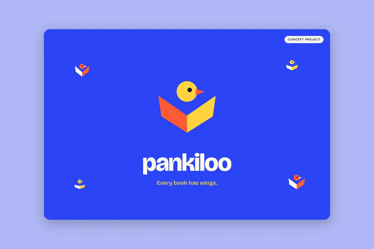
Pankiloo is a reading app with short illustrated stories set in India. It needed a logo and identity that children spot instantly on a home screen and that parents trust with screen time.
Audience: Children aged 5–10 who are building a reading habit, and the parents who choose and pay for the app.
The insight
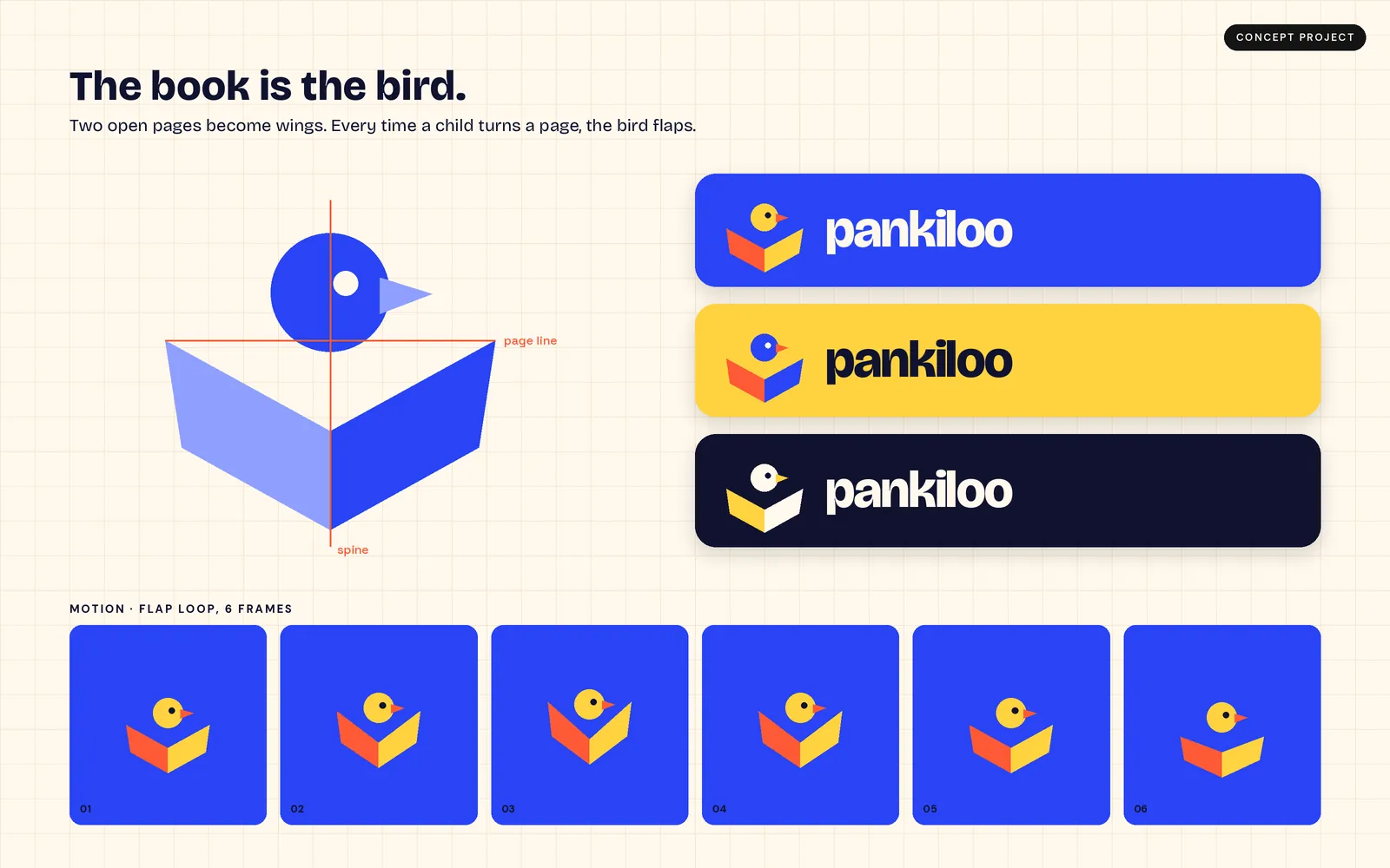
Kids don't want 'study'; they want flight. An open book already looks like a bird mid-flap, so every book has wings.
Business objective
Create an identity that stands out in a crowded app store, scales from icon to banner, and gives the product team a mascot-like mark for rewards and campaigns.
Visual direction
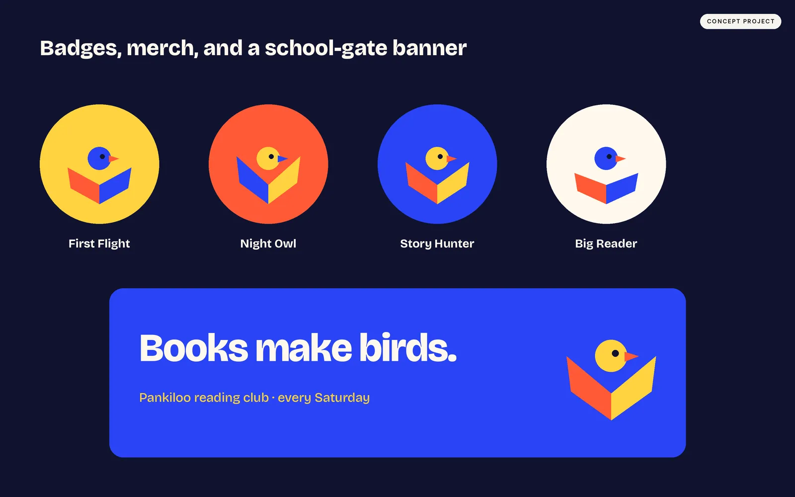
A geometric bird built from two open pages and a round head that flaps whenever a page turns, set beside a chunky Bricolage Grotesque wordmark. Cobalt, sunshine yellow and tomato red keep it bold at 48 px, and reward badges and a reading-club banner carry it into the real world.
Deliverables
- Logo mark & wordmark
- Construction grid
- Colour variants
- Flap-loop motion frames
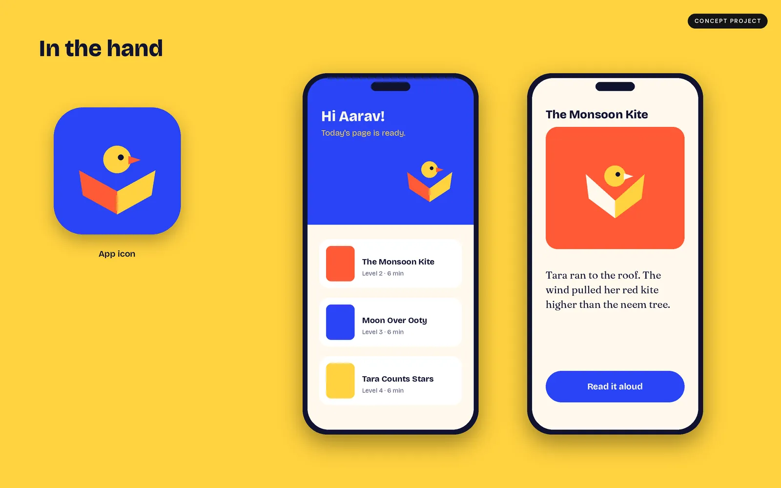
- App icon & core screens
- Badge set & reading-club banner
Gallery